Today, Google+ got a new look, including features like interactive navigation and profiles that look similar to Facebook’s Timeline layout that officially launched last month.
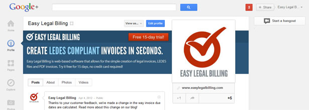
Google says improvements will be rolled out “over the next few days,” so don’t fret if you haven’t seen the change yet. The Cypress North Google+ page hasn’t seen the upgrade, but one of our other clients has, so we decided to spruce up Easy Legal Billing’s Google+ page and write up a quick post about sizing for your cover photos.
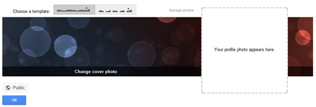
It appears that the displayable area for the cover photo on Google+ is 940 x 180 pixels. You can upload larger images as long as they are a minimum of 940 pixels wide. The image tool will allow you to crop to the correct dimensions once your image is uploaded.
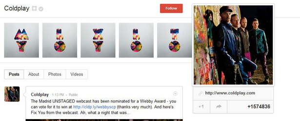
If you don’t have the ability to create a full-width cover photo, you can also use the alternative template offered that displays five images in a “scrapbook” format, like Coldplay does here:
If you decide to design your own custom cover photo with marketing messages, be sure to leave some left margin space so your text isn’t too close to the left edge. In addition, you’ll need to make sure you don’t place any important info on the right side as your profile image will block whatever is underneath. We believe the profile photo is about 252 x 252 pixels.
Other features of the new redesign include bigger photos and video, a discovery section where users can view current trends and hot topics on Google+ as well as an interactive navigation and hangouts page. Read more about these improvements here.


