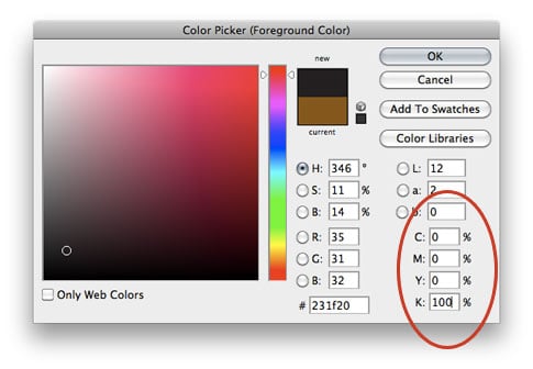
I’ve got a quick Photoshop 101 tip for print media. This can also apply to Illustrator, but I just filed it under Photoshop. We should all know by now that RGB documents are meant for screens, and CMYK documents are meant for printing. Therefore, when you print a CMYK document and you need a really rich black it’s important to remember one little teeny tiny thing: 100% K isn’t the blackest black you can get. More after the jump.

Believe it or not, when working in CMYK for print media, 0 0 0 100 is not the best black you can get. If you have a keen eye, you might be able to tell by the image above.

If you’ve ever printed out a file or document or design (a complex illustrator document, for example) and most of the blacks were black, and one or two of the shapes appeared more gray, there’s probably a simple explanation. The blackest-black you can get when printing in CMYK is C-75 M-68 Y-67 K-90. Yes, you can accomplish this by simply dragging the color picker all the way to the bottom left, but when dealing with complex documents, and one of the blacks doesn’t print right, it’s good to know where the problem is. (especially documents delivered from clients)

It’s a simple tip, but I hope it reaches somebody who needs it 🙂
