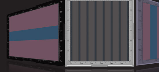
Grid Basics
Let’s talk some grid lingo. A grid is the division of a layout with vertical and/or horizontal guidelines to incorporate margins, spaces and columns in order to provide a framework for organizing content.[ad code=1 align=center]
Grids are traditionally found in print work but are very applicable to web design. A grid doesn’t have to make a site look like a newspaper’s layout, but it can certainly aid in creating a uniform structure to start the design with.
A grid is simply a tool to help designs, not something that should hurt the design in any way.
Understand and Follow the Rules
When you start learning a new skill in any given subject, you should follow its guidelines. Learning the fundamentals from the beginning ensures that you are able to apply its principles effectively.
Starting out with grids is no different; you should follow the grid and keep all your design elements aligned and in its place. Using a grid within your designs helps bring structure to your content and gives you a place to start from, but should never stifle creativity.
There are two ways to establish a grid template:
Create your own grid
There are many different theories on the best way to set up your own grid and the options are endless, but in the end, you must choose what works best for you and the project at hand.
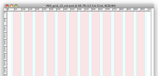
You can divide a blank document mathematically, creating an even or odd number of columns to work with. It’s usually helpful to think about gutters—the space between columns—and integrate them into your grid system as well.
Your grid can be as complex or as simple as you like. The more complex and elaborate your grid layout is, the more freedom you have within it. The simpler it is, the more room for interpretation there is. The choice is up to you.
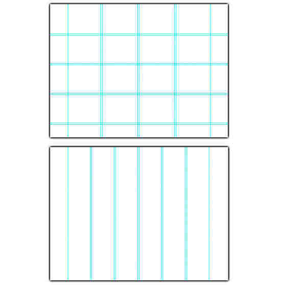
Here are a a couple of examples of grids that are created in Photoshop using guides (View > New Guide):
Download a ready-made grid template
There are standard grids available for you to use that will aid website development, as well as cut down the amount of time it takes to create your own.
Perhaps one of the most popular grids available is the 960 Grid System. Started by Nathan Smith, the system allows for you to choose from a 12, 16 and 24-column grid.
The project started as a way for Smith to “scratch a design itch.”
“I am simply sharing the grid dimensions that I have found myself gravitating towards over the past year or so. If others can benefit from that, then all the better,” says Smith about the 960 Grid System.
The download package includes files for CSS, HTML, Photoshop, Illustrator, InDesign and more. The design files include several grids that are very helpful in setting up a structured and clean site.
Break the Rules
Now that we’ve covered the very basics of grids, let’s break out of it! Grids are a great way to line up items, keeping your designs clean, user-friendly, and streamlined.
However, as I mentioned before, you can’t let the grid stifle your creativity and make you feel like you’re trapped within it’s borders. Feel free to venture out of the guidelines; everything doesn’t need to line up in order to make a gridded design work.
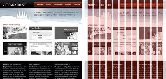
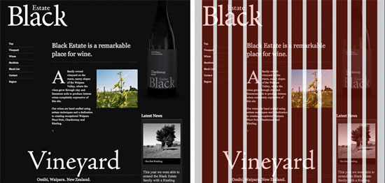
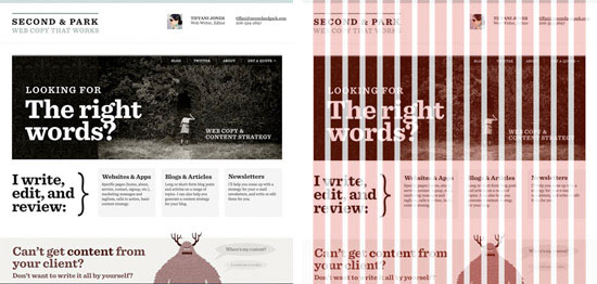
Items that break the grid help the design feel more organic and free-flowing, instead of table-based and boring.
Check out some examples from the 960 website with grids laid over the design, showing that grids can be beautiful and not so structured.
Examples of Grid Based Designs
Here are a few examples that showcase great designs and organized, user-friendly interfaces.
Some are strictly grid-laid, while others show some signs of breaking outside of their base grids.
All of them highlight the fact that using a grid doesn’t have to mean a boring-looking site.
Help Your Habitat
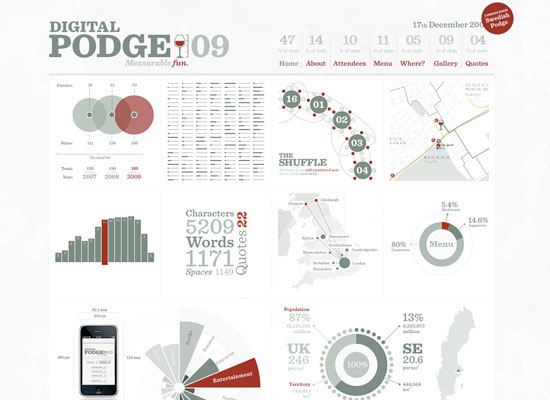
Digital Podge 2009
Vegas Uncork’d
Anton Peck
Brite Revolution
Kiki and Bree
Arvorecer
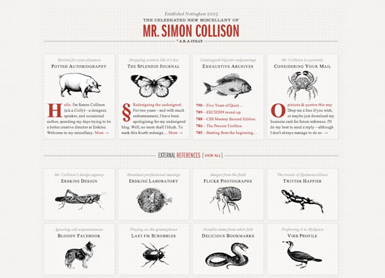
Simon Collison
Fun Tools for Using Grids in Designs
Here are a few tools for experimenting with grid-based web layouts.[ad code=1 align=center]
Grid Designer
A fun tool to help set up a grid.
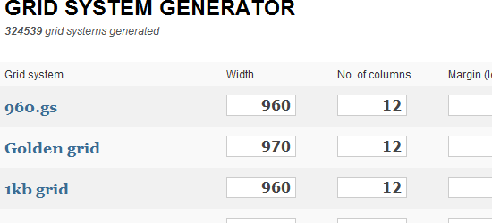
Grid System Generator
Just as the name of the tool says: it helps generate a grid for you.
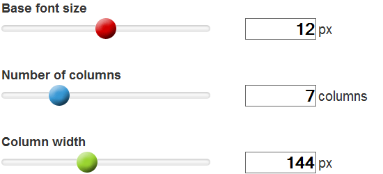
Grid Calculator
Another fun tool to help set up grids.
jQuery Masonry
A jQuery tool that arranges items vertically and horizontally according to a grid.
Slammer
A grid layout application that overlays any grid anywhere.
Tutorials on Using Grids
- GridControl: A Grid Overlay System for Design Development
- Developing the grid that supports your design
- Grid Design Basics
- Applying Divine Proportion To Your Web Designs
More Grid Resources
- Myths & Misconceptions About Grid Systems
- Designing With Grid-Based Approach by Smashing Magazine
- 65 Resources for Grid-Based Design
- Grid Based Design Toolbox
- The Grid System
- Design by Grid
Grids are not the solution to every design problem and they don’t work for everyone.
thanks http://sixrevisions.com/web_design/a-brief-look-at-grid-based-layouts-in-web-design/
[ad code=1 align=center]
